


NickN
Established Member
On a constructive note:
Positives: since the initial launch of the new forum I'm pleased to see that the colours have been toned down and the text appears darker - it's now a lot easier on the eyes when reading. I've even got used to the wide right margin, and have reduced the left margin to zero using the CSS workaround. The frame around each post too is something that takes getting used to but I don't mind it now.
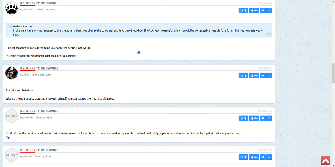
Negative: it appears that for certain shorter posts, because the User Info/Avatar is now above each post rather than to the side, a disproportionate amount of screen estate is taken up by the remainder of the very white User Info frame, which gives the impression that posts appear a long way apart and become disjointed rather than flowing nicely. The larger text exacerbates this problem. However I concede that on the previous layout, when a user had an avatar and made a short post, it also caused a lot of blank space to appear - I guess because the text was smaller it visually didn't look quite as bad.
EDIT: after posting the two screenshots together, it's obvious that space taken up is pretty similar, so it must just be the white background and larger text that gives the impression of more space, not sure to be honest!
The screenshots below illustrate this point.
Positives: since the initial launch of the new forum I'm pleased to see that the colours have been toned down and the text appears darker - it's now a lot easier on the eyes when reading. I've even got used to the wide right margin, and have reduced the left margin to zero using the CSS workaround. The frame around each post too is something that takes getting used to but I don't mind it now.
Negative: it appears that for certain shorter posts, because the User Info/Avatar is now above each post rather than to the side, a disproportionate amount of screen estate is taken up by the remainder of the very white User Info frame, which gives the impression that posts appear a long way apart and become disjointed rather than flowing nicely. The larger text exacerbates this problem. However I concede that on the previous layout, when a user had an avatar and made a short post, it also caused a lot of blank space to appear - I guess because the text was smaller it visually didn't look quite as bad.
EDIT: after posting the two screenshots together, it's obvious that space taken up is pretty similar, so it must just be the white background and larger text that gives the impression of more space, not sure to be honest!
The screenshots below illustrate this point.