Holly Bowl

UKworkshop.co.uk

Help Support UKworkshop.co.uk:

This site may earn a commission from merchant affiliate links, including eBay, Amazon, and others.

KimG

Little Woodworm
Joined
2 Jul 2012
Messages
1,138
Reaction score
28
Location
Pembs
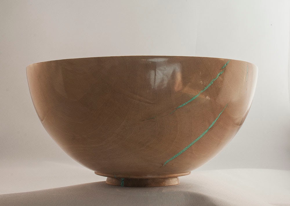
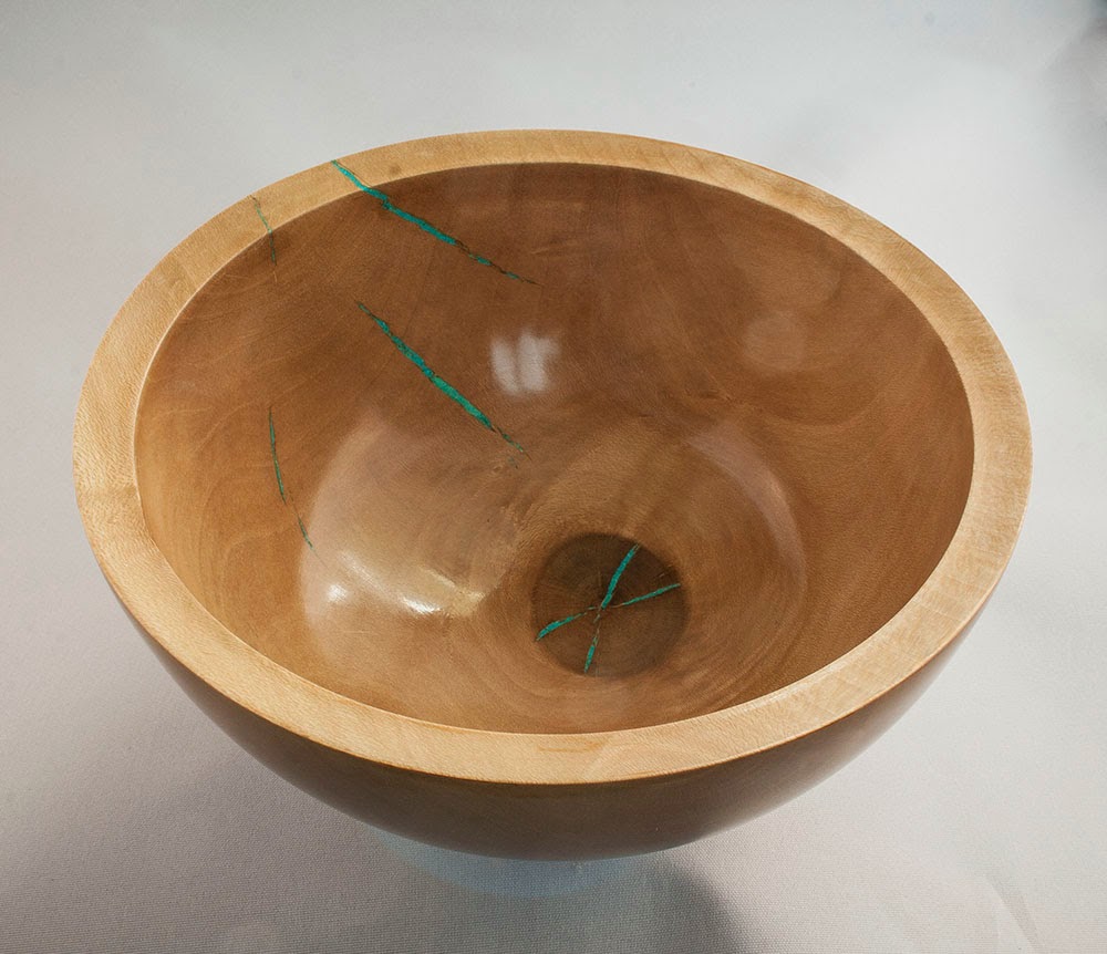
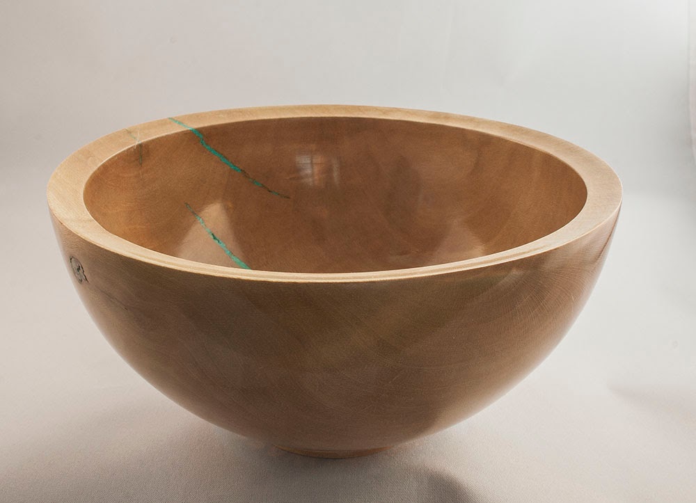
This was an item that nearly got binned, the splits were a consequence of leaving the wood in the round too long and as such they were not very pretty, but in the end I thought I may as well try a colour fill, it works for me at least, but it certainly hasn't worked for everyone who has seen it, it gets a mixed reaction. I am pleased overall with the bowl shape though, a slightly undercut rim inside lends a nice shape to the interior. Finish is the usual shellac. It's about 6 inches across.
Holly-3.jpg


Holly-4.jpg


Holly-1.jpg
 
I often fill cracks as you have Kim but not with a colour like this. Personally I don't have a problem with it though I might have chosen a different colour, green isn't my favourite LOL. All in all a nice save of a lovely clean looking bowl. Worth the effort IMHO

Pete
 
I like that as well Kim, its surprising how that little bit of inner rim undercut seems to enhance the visual impression.

Know what you mean about mixed reaction to the filling, I have an output absorber that will take all sorts of rustic blemishes as long as they are natural and whole but anything that hints at 'broken' or 'repaired' is not acceptable.

I personally think the bright colour and contrast of the filling goes well with the high gloss, I see why you are happy with the consistent bowl curve, not so sure about the foot in side view but I guess it's fine in the flesh as it's hidden and does not draw the eye.
 
Nice shape and finish is up to your usual standard.

CHJ":16rscyam said:
but anything that hints at 'broken' or 'repaired' is not acceptable.

I think this is the problem in some areas where as in others they see it as decorative, I feel that if the cracks are filled and tried to be hidden but yet are still visible people will look at as if it has been repaired where as by using a contrast they would look at it as part of the piece
 
This is where wabi sabi comes in. The idea that repairing something actually enhances it. Cracks, splits, wear and tear are all seen as part of the beauty of something. I don't try to hide natural faults but use them as Km has as part of the pieces appeal. Generally I find people accept it.

Pete
 
Bodrighy":rmn5sh5w said:
This is where wabi sabi comes in. The idea that repairing something actually enhances it. Cracks, splits, wear and tear are all seen as part of the beauty of something. I don't try to hide natural faults but use them as Km has as part of the pieces appeal. Generally I find people accept it.

Pete
Pete this is What we discussed at yandles and you directed me towards mark sanger whom admire also I must admit I like the colour chosen and I think the piece is presented well enough to grace anybody's home also I agree that repairing a failed or faulty turning gives it a unique appearance that is bespoke and this is what we have hear I hope I have explained my comment without upsetting anybody as I found that your turnings are in a league of their own I seen it on the table at yandles and this is one that gets my vote
Regards
Bill
 
Since I only joined this forum at the end of January, I’m still cautious about proffering an opinion about other members work. Kim’s work I’ve noticed and admired and this particular piece speaks to me because the first piece I made using my new XT650 chuck had the bark inclusion with voids which I filled with Bronze filings so I can appreciate the recovery.

I’m with Bodrighy as far as the colour of the filling is concerned - the blue/green feels a shade too far - but I do think that a strong contrast is needed.

JG
 
Nice to get some feedback on this bowl, appreciated! :)

The colour used is more a blue turquoise than green (an effect of the photography), however, the contrast remains the same, for a perfect contrast I would have gone for a pale blue, you can find the perfect contrast colour for something with a photoshop trick, (obviously you need photoshop or similar!) but load up an image into the program and from the image adjust menu, select invert, this gives a negative image and the colour of your item is now the perfect contrast, this is because contrasting colours are opposite each other on a colour wheel. I don't have any pale blue fill though, and am exploring different sources to see if a wider range can be acquired.

I am with you Chas on the foot, they are such tricky things to get right.
 
that works really well for me. I notice that it's not on your website, nor are there any prices on there. Is it a case of if I have to ask then I can't afford them? Nice work kim

nathan
 
Thanks Nathan, I hope not!

It is a case of, I haven't yet put it up.

For prices though click on the shop link, that will take you to the Etsy page through which I am currently selling. There are more items there than the site which needs a better image handling arrangement than it currently has, I find it a bit clunky ATM.
 
Undoubtedly the most wonderful aspect of this bowl is it's form. Very graceful and it looks like it would handle naturally. I also think the foot works well, whilst turners will see a dovetail spigot, anyone else will just see a well proportioned and detailed foot that complements the overall form.

Repairs to faulty wood I generally like, but vibrant green ? no thanks. It takes the eye away from the elegance of the form, interest and depth to the wood's figure, which is otherwise nicely enhanced by the excellent finish.

My own taste is for fillers that don't dominate a piece and distract from the overall form. Black or dark brown would be fine, even a neutral metallic fill like silver or pewter would have worked well, but vibrant colour doesn't work for me on fills like this.
Colour can work well in turned work, but in my considered opinion it's best as a positive designed element, not just added randomly on a piece like this.
 
I like the colour Kim its a nice contrast to the colour of the Holly,looks like the green colour you get on copper which the bowl is near copper colour so works for me :D
I would remove the extra foot and just keep the beaded foot which looks good.
Overall though a lovely shaped bowl with your usual excellent finish =D>
 
Nice salvage of the piece. The bowl has a good form and it would be a shame not to salvage it. I like the green fill - some holly has almost greenish streaks in anyway.

Holly is a lovely wood, but it does like to split :-( I have one holly bowl which has no splits in at all and is still almost creamy white. All the other blanks from the same large log given the same treatment split. I have one awaiting finish turning that I may give a smilar salvage treatment too.
 
I still have 3 7' long trunks of Holly from 5" diameter up to about 8" they have been stored upright for over a year now. The ends are starting to split but not too bad just have to wait now to see if they get any worse.

KimG forgot to ask what is the infill material and where from
 
It's a turquoise powder that George Watkins was kind enough to send me, I think I remember correctly that he gets it from the US. I brush it into the crack and then add a bit of CA, brushing more over that to form a filling.
 
I like the way the colour emphasises the fact that it is made from wood with natural flaws rather than trying to hide them.
 
I suppose, since this is a wooden object, its the Hollywood Bowl.

Okay, Okay, Let me get me coat first.
 
Back
Top