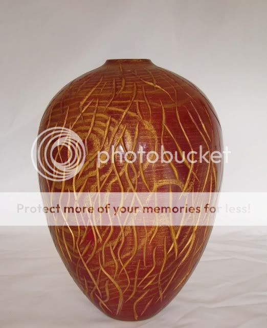
This looks like an old ceramic pot, don't know if that was the intention or serendipity. Looks good to me though I suspect some may not like the fact that you can't see any wood. I especially like the textured effect from the 80 grit.
Shape is good for me as well. Overall a big + as far as I am concerned
Ok, I looked, I liked, as Pete says shouts ceramic to me too.
Curves look controlled and contiguous and judging by the comments of others about similar forms regarding the narrow base it hits the mark. The complimentary colour/contrast level between the lacquer and the gilding appears well balanced and adds interest without shouting too loud.
Absolutely love it George. The right combo in my book. If you want super critical, I think I can detect a slight flat on the lower curve, about half way up. Might be trick of the camera or my wonky eyes. But it's only there when you look for it.
Very nice decoration of the piece George. That gilding cream really does the business with Ash . Like Tom I too can see a slight wiggle in the curve of the form(a dip inwards from the outline) which catches my eye as I look at the piece .
Still very nice decorative work though 8)
Very very nice looking piece George
The two colours go great together i think,and the carving goes with the grain.Looks like a river scene to me,with the grain as ripples going through the rising weed :? very effective
.....I think I can detect a slight flat on the lower curve, about half way up. Might be trick of the camera or my wonky eyes. But it's only there when you look for it.
I too thought that at first glance but if you enlarge the image and study the curve I think it's just the light highlites reflecting on the surface between textures that's giving a lower contrast than the background.


 . Like Tom I too can see a slight wiggle in the curve of the form(a dip inwards from the outline) which catches my eye as I look at the piece