Interesting pieces of furniture-5

UKworkshop.co.uk

Help Support UKworkshop.co.uk:

This site may earn a commission from merchant affiliate links, including eBay, Amazon, and others.
A

Anonymous

Guest
Hi all

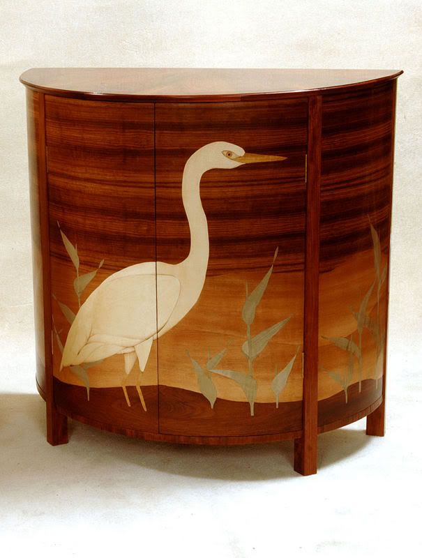
The fifth piece of furniture in the series.

This one was another suggestion I received from a member in my 'inbox'

He says:
It's a Paduak veneered Drinks Cabinet with inlaid Marquetry design in Lace Wood and stained Beech. Highlights by hot sanding. Shellac finish and lacquer. A 'modern' (year or two) pieces by a student.

PadaukCabinet.jpg


All are welcome to comment on the pieces and please pm me with links to any photos that you would like featured here and a few lines explaining why


I will copy all items of furniture I post here into a single sticky thread in the Design Forum, thus creating a pictorial 'list' of interesting furniture here
 
Although I admire the workmanship and the time involved in making this piece, It just sucks, it don't fit in to be of any use, well not in my house. Sorry I'd rather buy something from Ikea. :cry:
 
Very nicely made and a pleasant shape. A very smart finish, too. The thing that makes or breaks it is the marquetry. It doesn't quite hit the spot for me, either. But then I'm not into arty stuff too much :lol:
Cheers
Philly :D
 
I am no expert on woodwork by any means, But I too don't like it.
As Lord Nibbo says, lots of time and effort gone into it but it's not for me.

The only one thing that caught my eye was the way the grain of the wood at the birds feet looks like ripples....was that intended or not?

Who knows.

RPM
 
Fantastic marquetry, I'm sure the ripple effect is intensional, would I attempt a piece like this, NO, I couldn't give it away.

The market for this type of stuff is tiny, people want modern furniture with clean looks, a million miles from this.
 
This one is a bit of a paradox. The cabinet form without the marqeurty picture is weak, and the marquetry picture without the cabinet form is weaker still, and they dont seem to work together, the picture might as well have been on a flat door or a screen or something. Its a shame that the gap beteen the door's is a bit thick and black. But maybe I shouldnt be too critical, he's only just starting out, its ambitious for a young lad to do soemthing like this and no doubt he learnt from it. Neither cabinet making or marqeutry is easy.

cheers Mr S :D
 
Technically admirable particularly in the application of the grain in the marquetry. However, I think the proportions are 'off' (kind of 'dumpy') and the marquetry design looks...well, naff. That said, I'm no expert, but if a student of mine made it I'd be very proud of them.

Ike
 
For me, another example of how great craftsmanship doesn't automatically have any connection with quality of design. The marquetry looks extremely well executed, but the 'picture' is very ordinary at best. The 'art side' of the piece isn't nearly up to the standards of the 'craft side', and it would have to be to pull off a piece like that with total success.

Very well made by the looks of it, though, especially for a student. I'm judging these things against my favourite pieces of furniture and design, not what I can do myself!
 
Hi Tony--thanks for another one.

I like the shape of the cabinet--it's the basis for a couple audio and drinks cabinets I have made. Early 20th century modern, so that floats my boat.

Looking at the marquetry by itself, it is well done.

In combination with the cabinet and I think the marquetry takes up too much space. Out of proportion.

From the picture, nice use of grain, and I like the splitting of the knot and I think the use of the knot as ripples in the "water" was a nice touch.

I would rather the cabinet be without marquetry altogether.

Take care, Mike
 
If it was made by a student, then I am sure it was a useful piece to make in that the student would have learnt a lot of useful techniques - curved work, veneering, marquetry. It looks like it was very well made. However, as a piece of furniture I think it looks horrible (although I'm sure my mother-in-law would love it!). Very 1930s. I can remember as a child knowing several people who had furniture like this - they also had ornate mirrors with angular shapes and green edging :sick: As a piece of furniture, I couldn't live with it - sorry.

Cheers :wink:

Paul
 
Beautifully made, buuuuuut, It reminds me of my childhood, not that it was unhappy just that there seemed to dark furniture and faux birds everywhere.

Dom
 
Like Paul said,a typical student piece. Lets see how many techniques we can cram in to impress the examiners.

I actually quite like the basic cabinet - except for the legs, which need some shape to them.

But the duck!!! Aargh!!!

Cheers
Brad
 
Nice work,but he/she ruined the cabinet by putting marquetry on it,or ruined the marquetry by putting it on that cabinet,

overall a nice exercise for a student,curved doors/rails ect,piece looks clean,nice wood.I like to think the student moved on to greater things.

regards.
 
as others have said not to my taste but the workmanship for a student looks to be pretty good. Would be nice to see inside. Personally if I had to do something like that I'd look at a design that didn't go over teh join of the door - two smaller birds perhaps - one on each side.

Steve
 
MikeW":2crmiv4b said:
In combination with the cabinet and I think the marquetry takes up too much space. Out of proportion.

From the picture, nice use of grain, and I like the splitting of the knot and I think the use of the knot as ripples in the "water" was a nice touch.
Yeah, I'd definitely go with that. I think the transition from the bulk of the "background" veneer to the hills behind the heron/crane is nicely done too. If the bird and bamboo hadn't been so dominating I think I could have put this one down as a "like" :D On the other hand a smaller bird mightn't have worked as well with that natural ripple at its feet perhaps? Maybe less chamfer to the underside of the top leaving it looking a little thicker might have helped a bit too? Dunno. It's close, but not quite. Damn good workmanship though.

Cheers, Alf
 
It looks good as a 1930's retro cabinet, but doesn't do it for me I am afraid. I agree wit hthe 'out of proportion' comments. I prefer my inlay to be more in the Japanese black laquer style with scenes depicted rather than a huge central object.

Steve.
 
This doesn't do anything for me I'm afraid tho' the use of marquetry on a curved panel is quite clever - Rob
 

Latest posts

Back
Top