Please be honest.

UKworkshop.co.uk

Help Support UKworkshop.co.uk:

This site may earn a commission from merchant affiliate links, including eBay, Amazon, and others.

Woodfinish Man

Established Member
Joined
7 Aug 2008
Messages
314
Reaction score
0
Location
Glasgow/Edinburgh
I have recently put our first advert into the most recent edition of British Woodworking and would really appreciate some feedback.

I've shown it to friends who have been quite scathing. My only defence is that it's unusual/dated and makes people stop and read.

Am I deluded? Please don't hold back! I'm seriously considering changing it with a nice close up of a table being finished with a polishing mop.

Ian
 
Ian,
it obviously didn't work for me as I had read the magazine but couldn't recall your advert - though I did remember one for Osmo door oil.

Having reread the magazine just now, I've found yours and think it is too clever by half. I agree that you should go for a picture that makes it clear that your talking about polishing.
:( :( :(

David
 
Just went and dug my copy out for a look. It's OK but it doesn't leap out at you. It's not that apparent what it's for with a glance. Personally I like to see racks of the goods, showing that the advertier has a serious investment and so is likely to have what I want and some experience to back it up. I realise I may be deluding myself with an image like that but it's what gets my attention.
 
Hi Ian,

I agree with the earlier comment, to clever. I must admit to not really understanding it until looking closer in response to this post :oops: :oops:

I like the general layout of the ad, the header and the wording is good but I would go with a more traditional photo of finished work or your idea of someone doing some finishing is good I think. Maybe there should be a can of one of your finishes visible on the table being finished? I would then change the strap line from "on reflection....." to something more simple "Smith & Rodger finishes show your work at it's best" or similar.

Best of luck with it. I shall keep my eye open for your next ad!!

Cheers,

Richard
 
Thank Richard, Mike & David for your feedback, it's really appreciated. I'm definitely going to take your advice and make changes. Miles I'll try my best to get the advert up.

Right where's my camera...

Ian
 
The ad seems okay, though I had to look it up again, perhaps because I saw french polish and kept going - I don't use FP (yet!)

I think you may be caught between two styles, on one hand you have folks who will want to see (as has been said) examples of the product and others for whom a catchy non-product works.

In a bike mag I read (and this is a fairly niche bike mag, so you get a particular readership) one of the regular advertisers has his advert as a very irreverent and mildly offensive strip cartoon. He knows his audience, it stands out, it has minimal relation to the product he sells, but he sells niche, high end bikes and gear to a relatively small but rich and devoted customer base.

It was enough to make me to go to his website and have a look, but then I realised I don't want single speed, fixed gear mountain bikes etc etc

So my advice would to be have a think where you want to pitch your ad and who you want to pitch it at and go one way or the other
 
ad.jpg
 
I must admit I quite like it. Tho, from a business point of view, I wonder if it's you're best bet. I think French Polishing has a bit of a dated reputation and this advert doesn't really do anything to change that. A nice piece of modern furniture with a french polish might help to change people's minds ?
 
It's quite a clever ad - and fairly clear to me that you are a supplier of wood finishes. I'd probably look twice as it has a cartoon and has a somewhat different look & feel to most ads.

I agree with Richard Findley that the strapline is too wordy. Perhaps something more like "Smith & Rodger's products set off your workmanship so well." or "Smith & Rodger's products - what a finish!" (sorry that last one was a bit corny!)

I'd also make the list of types of finish to the right of the cartoon slightly larger - you could move the cartoon to the left to make a bit more space. I don't know how big the ad is in the magazine, but the list of types of products to me is an important part of the ad and should be easy to read for those of us who are getting on a bit.

However, as an ad it has worked - I didn't know about your company until I read this forum post and the ad and now I'll be paying a visit to your website :D

tekno.mage
 
Or an illustration of five or six paint brushes breasting the tape at a race track finishing post with the company name prominent on the winning brush with the caption,
"After leading the field we're still at the front at the finish"

Or is that too corny?

John. B
 
Hi Richard,

It's clever and will grab some people's attention. If you're brave enough to keep reading, I'll give you three specific things I'd try for next time (I do this kind of stuff for a living)...

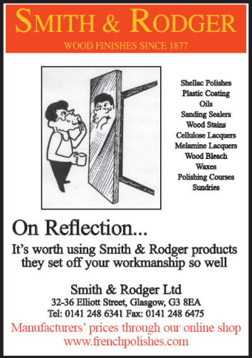
1 - Headline - If you think about people reading a newspaper, they skip through most of it, just reading the articles that grab their attention. The articles do that with curiosity invoking headlines. Your headline is your company name and so, I'm afraid, a bit of a waste of advert space in that prime top position.

Something like "Do You Hate Sanding & Finishing?" would certainly grab me! But - you must test results with each advert so that you know how well it's worked. Just because one or two friends/colleagues like it, does not mean it will actually work.

2 - There's no offer - so you're just telling people who you are and what you do. Coca Cola do this by spending about a $1 billion per annum on big adverts, just to protect their market share (around 50%). As small businesses, we can't afford to operate in the same way.

A different way to advertise is to put an offer of some kind in there - "August Only - Free Polishing Mop With Order", or whatever would be a decent free offer [make it something that doesn't cost much - and don't spend on huge stocks].

3 - There's no call to action - that's the final push to get people picking up the phone or visiting your website. e.g.

Order Now For Delivery Tomorrow
01xxxx xxxxxxxxxx
order online at www.xxxxxxxxxxx.co.uk

Hope this is useful to you. You'd be amazed the difference that a bit of this sort of thing can make to your advertising response rates.

It's worth picking up a couple of decent books on advertising, just like you'd buy a good book on finishing techniques if you wanted to be better at finishing, you're better off reading advice from marketing experts instead of the woodworking ones for help with your adverts!

I recommend Tested Advertising Methods by John Caples as a brilliant introduction to marketing in print.

Cheers,

Lee
 

Latest posts

Back
Top