Blue lidded form - for critique please

UKworkshop.co.uk

Help Support UKworkshop.co.uk:

This site may earn a commission from merchant affiliate links, including eBay, Amazon, and others.

Gitface

Established Member
Joined
5 Nov 2008
Messages
150
Reaction score
0
Location
Barnsley, S. Yorks.
Hi All

This is a Stained Scyamore lidded form:

Blue_HollowForm_wLid.jpg


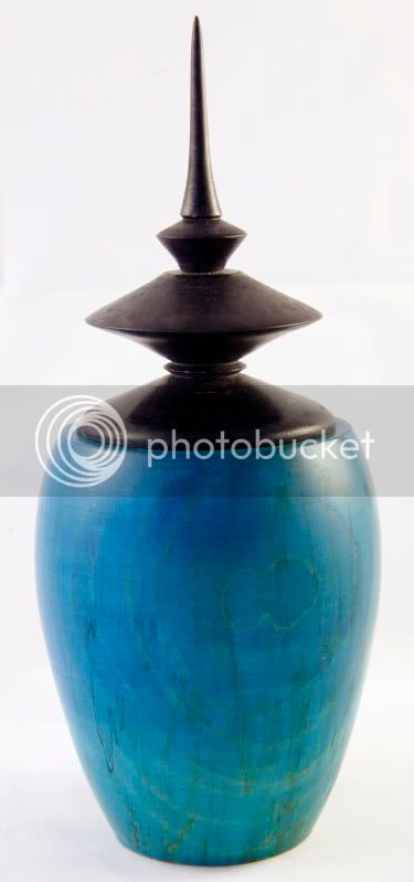
This was going to be a plain stained blue hollow form but while shaping the top in reveled a split running across the top, so I decided to cut this back and open it up and make a lid for it.

The blue is again printer ink diluted 1:9 and the top was done with black ink.

The blue was applied to fade to a deeper colour at the top.

I had a bit of trouble with the top and wax finish, I think that the ink had not dried fully and the piece was still damp, so I waited a couple of days, re-applied the wax and buffed by hand.

The piece stands 8" high with the lid.

Thanks

Mark......
 
This is a nice bit of experimentation Mark ..
I think I'd maybe have like the shoulders of the main form to blend more into the line of the lid.. but thats juts a 'refinement of concept' thing.. just to let the line 'flow' as one, if you know what I mean.

But a sterling effort nonetheless ! :lol: 8)
 
Hi Mark

This is a great start. The advice which I found helped my work a lot was to "observe everything" we often look at other work and ideas but very seldom "see" the fine detail.

If you are interested in hollow forms there are many turners that you could look at. Two I have added the links for here are in my view some of the best at form " Andy DiPietro" and form/finial interaction " Cindy Drozda"

Take time to look ate really see how the lines interact with each other. how the bases tuck in under the forms to produce a flowing line which does not appear to touch the table. This one example gives the forms a soft/lighter lift.

Look at the way Cindy Drozda's finials go from one line to another and how they relate back to the main form in shape and size.

http://www.woodartforms.com/
http://www.cindydrozda.com/
 
again, from the shoulder:

a complete mismatch both in colour and form...

Think aesthetics...

[but keep 'em going, 100% perseverance recommended :wink: ]
 
Mark, I think this is the best of the bunch for surface finish and a reasonable first effort on this type of form. Very mismatched on the proportions of body to finial and flow of form but as Mark S says a study of his two references will give you some valuable pointers, not suggesting you should get disheartened if you have difficulty matching those standards, few of us are capable of doing so, but it's good to have a target to aim for.
 
Trying all the different techniques and styles is a good way of finding out what you are best at and where your personal preference lies. I have pages and pages of pottery, glassware etc downloaded for the reason Mark gives, there are surprisingly few different shapes even cross culture. Getting your technique right is probably the most important thing whatever style you go for though and that only comes with practice. Even after turning for a while you will do things that just don't work (evidenced by my last posting for critique :lol: ) but the feedback you will get all helps. Keep experimenting and at the end of the day don't lose the sense of fun in turning.

Pete
 

Latest posts

Back
Top