Another Sycamore Form

UKworkshop.co.uk

Help Support UKworkshop.co.uk:

This site may earn a commission from merchant affiliate links, including eBay, Amazon, and others.

johnny.t.

Established Member
Joined
29 Oct 2008
Messages
1,714
Reaction score
0
Location
Norfolk, near the sea.
Heres todays effort, its made from the 2nd quarter of the log my Sycamore form from the other day was made, it has some really nice figuring in it. The lid and finial are also made from sycamore, heavily textured and are coloured with black acrylic. Everything is finished with acrylic laquer. About 11" tall with the finial.
sheildtop.jpg

Comments and critique welcomed.

JT
 
The form looks really good. The shape works well with the wood. The finial seems too heavy for my taste however. Not the height just the overall appearance. Is it flat as it looks in the image or round? It seems to overpower the look of the piece

Pete
 
What a beautiful piece of Sycamore Johnny. :shock:
Love the form but i think with the dark black streaks in the wood i think i would have gone with something more to match the thin streaks of spalt for the finial.
Great work JT :D
 
Very elegant johnny, the form and finish achieved makes the most of that outstanding wood figuring.

Like Pete I don't think the finial does the base justice, it seems overpowering, too tall and hard lined and at odds with the base form.
 
Another who loves the piece and dislikes the finial - it seems to almost stab and overpower the vessel.

Miles
 
Hi Johnny

the same as WOW, I know I can write for England but it is easier to cut and paste.!!

wow you lucky person you having sycamore like this. It is a powerful piece in that it reminded me of a sort of tribal totem/symbol, showing power and watching over or giving out a message.

Initially I found the finial to be over powering to the extent that I thought proportionally it was incorrect. However from looking at it I can see that it is proportioned right, so I was then confused as to why I thought this. I think it may be that the form of the finial is totally different to the base form and not connected to it.

IE the flow of line of the shoulder of the base form is at no time replicated or complimented by the finial.

However contrast is not a negative and can enhance just as much as compliment.

By lowering the main curve of the finial to say 1/3 up from the base of the finial itself may give a different feel and perhaps not such a powerful message, as well as trying out making the holes smaller as they ascend may add to the lightness.

However

These are just a few ideas that you may find interesting to play around with. It may have been your intention to have a powerful finial and message coming from the piece. So the ideas above are merely ideas.

I like it very much and can see you having fun with these pieces.

Take care

Mark
 
that's a point George

It may also look nice on a small black plinth which may tie the top into the base.
 
Absolutely love the vase,

Partly agree with Mark however, I think I would have put a twist in the finial a la, 'The eternal flame'

Wonderful figuring though. :wink:

John. B
 
I agree with the masses. I like it but the finial and form don't sit well together. The finial might look nicer on a shorter wider piece.
 
Thankyou all for taking the time to look and give your comments, its very much appreciated and given me a lot to think about. I'm not entirely sure of the finial myself :lol: but will give you the thoughts behind it and how it came about.
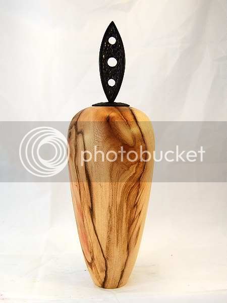
I'm enjoying making these taller narrower forms and have cut a log to make 4 from,this being the second. This one is supposed to be about the finial, that is the finial is the main thing you notice. Mark got it just about right with the tribal feel to it,the lid itself is textured in a way to give it a rough(ancient) carved look as is the upright part although it has a smooth border around it. The shape is supposed to represent a symbol of some long forgotton god, such as may have stood in a centre or entrance to a villiage with the central hole being the eye of said god looking over his people. One hole didn't look right so the other two were added as an afterthought. I know that all sounds pretentious but these are the thoughts that went into it.
Maybe Toms right and the finial would sit better on a wider piece :-k

JT
 

Latest posts

Back
Top