Critique required.Four Peaks.?? New piccy added.

UKworkshop.co.uk

Help Support UKworkshop.co.uk:

This site may earn a commission from merchant affiliate links, including eBay, Amazon, and others.

Paul.J

Established Member
Joined
27 Sep 2006
Messages
5,754
Reaction score
1
Location
Birmingham/England.
I turned this Spalted Holly bowl some time back,which developed a small split in the side.
So after seeing George Fs piece the other week that gave me the idea to do something similar with this piece.....
Largeholly2.jpg


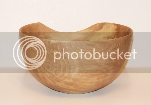
and this is the result.
After marking the cut out lines on the bowl the idea of a mountain range came to mind so went along with taht theme,four pekas sos to speak :lol:
I decided to paint the inner black to give contrast against the white outer and so that you could see like a silhouette effect.
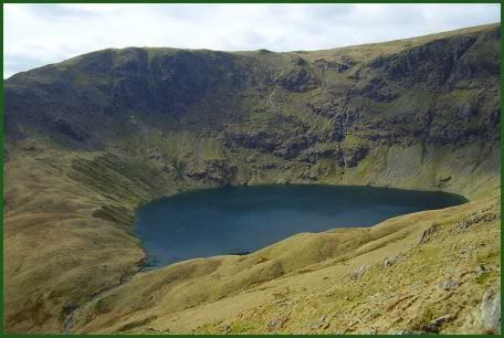
Then i remembered seein some where in the lake district a small lake right at the bottom of a range of hills,so i turned a small oval shape and stained that blue to give me my small lake.
Then i thought about having a path leading all round the top edge of the piece,so the eye follows it all theway round,so pyro'd that to give a well beaten pathe effect.

peaksnewpic.jpg


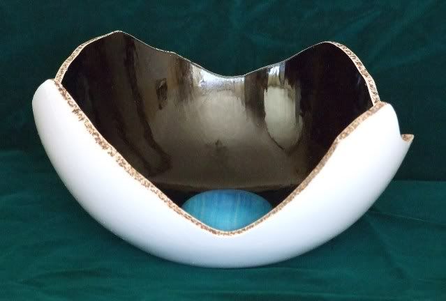
I don't think i'll be rushing to do another,but it is good way of using a piece that splits.
So critique will be welcome on my first ever,and probably last painted piece :D
 
yeh not keen meself. I liked it more before. We have to try these things tho. I'll probably do the same one day.
 
Good try Paul :lol: . I might have been tempted not to paint the outside as its a nice piece of wood but one to put on the lounge shelf anyway!
Steve
 
Paul, without first reading your story, my first thought was Paul is infected by the work of George.
I love your story about the Lake District, range of hills, and the lake on the bottom, and the walking path. You have a great imagination.
I know about the lakes in the Lake District, your creation is a look-alike.
And what else to do to get rid of cracks, well you found a proper and nice looking answer.
For me, give it a repeat, it's very nice.
Ad
 
Well I'd say you certainly met your own brief with that Paul, disciplined masking for the contrasting colours and the textured crest 'footpath' provides a good break line but provides enough blend to lead the eye around the rim.
 
Firstly I have to say that I really like the piece before you started to tinker with it ;)

I really like what you have done with it, it is a slight shame that you have lost all of that lovely grain pattern, but the finished product is lovely, especially as you have a definite story behind it.

I think it would really benefit from being photographed on something other than a white background, it makes the outside blend into the background somewhat.
 
Thank you for the comments,and pleased but suprised that some of you like it. :shock:
Gotta say though that the paint work is rubbish looks a lot better in the piccy than what it really is,it was brushed on,and no matter how careful i thought i was been there would always be a tiny hair or bits of whatever on it.
The original bowl was a nice finish but the grain pattern seemed to fade the longer it was left which was also another reason why i used it to do this piece.
I was pleased though how more ideas came into mind as i was doing the piece,which was interesting.It did make me think about it.
 
Hi Paul,

I too liked the original piece.

You have certainly followed your own brief, and the piece accurately represents what you have set out to produce. The shape is identifiable as four peaks, with a lake in the valley and a footpath along the ridges.
Sorry, still not convinced about the white, however.

Malc :D
 
Paul, I like the thinking you have put into the piece and the fact there is a reason for the different parts :D But overall I'm not entirely sure if I like the finished piece :? Keep experimenting though 8)

JT
 
Thank you Malc/Johnny :D

The Shark wrote
Sorry, still not convinced about the white, however.
The idea Malc was to set the black off against the white as a background ,so you see different views of the piece as it is viewd from varying angles.If you see what i mean. :?
I will try and take a better piccy of it.

Here is a piccy of what i had in mind.

lake.jpg
 
Hi Paul,

I know it may not be the main part of your piece but I really like the blue ball, a very nice tone of blue and sits really well in the black interior, nice glossy finish too with reflections which I also like.

However, like msot others I'm not keen on the white. I thought about this a lot as I also wasn't keen on Georges white contemporary bowl. For me, black is more associated with wood in my mind as it is not uncommon to see very dark woods or even black woods, also many lighter woods have black parts in them, but I have never seen a bright white part of any wood and therefore think thats why it looks a bit odd to me.

I do think that this piece would have looked fantastic had you left the outside of the bowl natural, but hey, what do I know, judging by my recent efforts I ain't got a clue what i'm doing, lol!
 
Hi Paul,
I see what you are getting at now, and the whole piece makes even more sense now you have explained that rationale.
Please don't be offended if I wasn't too keen on the colour, chosing colour isn't one of my greatest skills - I'm told it is a man thing :lol:

Malc :D
 
Glad you like it Frugal :shock:
Thank you for the critique Lee.
I think the blue ball is a main part of it now Lee,and the blue was just the right colour i had envisioned,straight from the bottle :D and i think it goes well with the overall idea of the piece.
Malc.No offence taken at all :D
I think that it is just difficult to try and get across to others of what i had in mind for the piece :D
 

Latest posts

Back
Top