Extension to make websites usable again

UKworkshop.co.uk

Help Support UKworkshop.co.uk:

This site may earn a commission from merchant affiliate links, including eBay, Amazon, and others.

RogerS

Established Member
Joined
20 Feb 2004
Messages
17,921
Reaction score
276
Location
In the eternally wet North
Given the current mania for designing web pages to have 95% white space on a decent sized desktop, I've worked out that these websites become usable if you shrink the window size to approach the form factor of a smartphone.

Are there any Firefox extensions that will automatically do this for you dependent on website ?
 
Thanks Nick but as far as I can see all that it does is zoom in/out. What I really need is control of the window size but I suspect that that is OS dependent in hindsight.
 
I adjust these "mobile size" web sites by using ctrl/wheel to fit a proper size monitor. The setting usually sticks for subsequent visits to the site. Using Firefox and Ubuntu.
 
RogerP":1t0jc58d said:
I adjust these "mobile size" web sites by using ctrl/wheel to fit a proper size monitor. The setting usually sticks for subsequent visits to the site. Using Firefox and Ubuntu.

I don't think that works on a Mac.
 
RogerS":1u0xwxwb said:
RogerP":1u0xwxwb said:
I adjust these "mobile size" web sites by using ctrl/wheel to fit a proper size monitor. The setting usually sticks for subsequent visits to the site. Using Firefox and Ubuntu.

I don't think that works on a Mac.
Shame because it's so quick and easy.
 
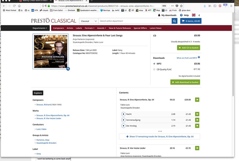
Nice idea, Nick but doesn't help, I'm afraid. This is the problem that I'm trying to solve. I'd sack the numbnuts that designed this web page. Click on it to show it full size and revel in the c**p design.

 
I wonder if some of what you see as a problem is actually ok if different records are displayed?
On your screenshot, the text is quite short, in both left and right hand columns. If (for example) you stay on that page and show the rest of the tracks, the entry for "Durch Dickicht und Gestrüpp auf Irrwegen" still displays nice and tidily, although it's a lot longer than "Nacht". And there are plenty of composers with names longer than "Strauss" so the designers have to take account of the range of values that their database holds.

I'm looking at it on a 21" monitor, with the default font setting at 20 pt.

Try this page as another example of one with more text - I think it would easily look too crowded if the space was reduced: https://www.prestoclassical.co.uk/class ... et#related
 
Agreed, Andy, but if they didn't devote 50% of the screen to white space. If I change the form factor of the window to be more like a mobile then it fills out nicely. And that really is my beef with website designers. They ignore the millions of us who still use a desktop.
 
Now you put it like that, I remember that there's a feature built in to FireFox to emulate all the different sizes of screen that developers need to design for. It might be a quicker way for you to mimic a smaller screen device and get the text the way you like it.
You can get to it with Ctrl + Shift + M - but that's on Windows, so you'd better go to the three line menu at the top right, then Web Developer, then Responsive Design Mode, and scroll through the various tablets, mobiles etc till you find one you like.
 
Maybe you could listen to some soothing music at the same time? :wink:
 
Back
Top